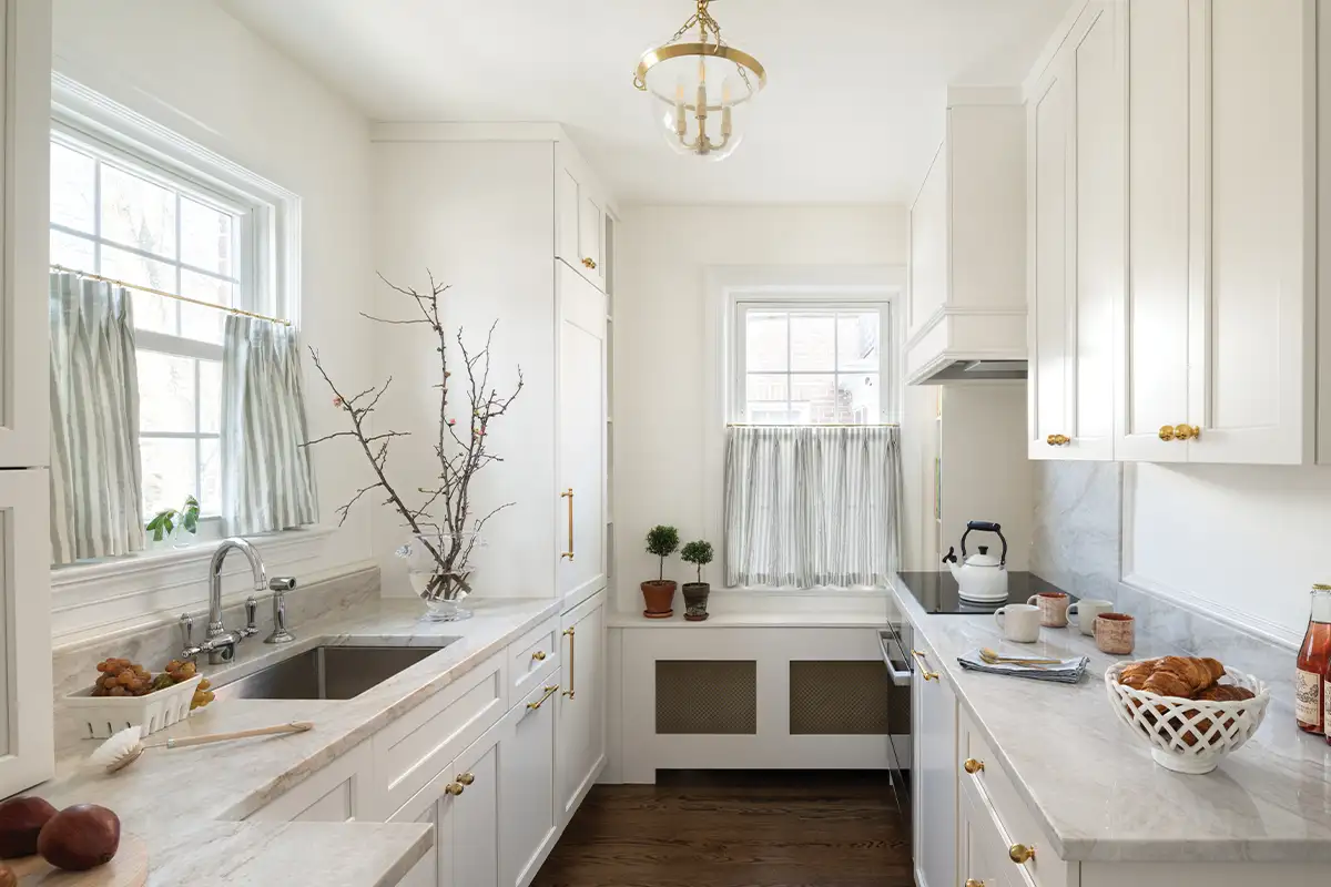
This year, interior design is all about color — and it’s not just limited to the walls. Color drenching is a popular design tactic to completely douse a space with one color: the walls, the trim, the furniture, and often, even the ceiling.
“Color drenching is a technique to create almost sensory deprivation. So, it creates a calming, just overall atmosphere that allows homeowners — or whoever is in this particular space — to feel like they can focus on exactly what is going on in their space without a lot of outside noise,” says Tracy Morris of Tracy Morris Design.
Although it has really taken hold in recent years, it’s not a new technique. “It’s been around for hundreds of years,” says Susan Sutter of Susan Sutter Interiors, pointing to the classically dark smoking lounges often seen in historic homes.
Here’s how some DMV-area designers have implemented the technique, and how you can use it in your own home.
Small Space, Big Impact
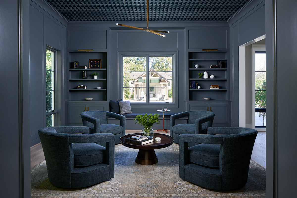
Color drenching can make a really big impact, so it’s often best to do it in small doses. “If you are going to do a dark, moody room, look at something in your house that is not one of your primary spaces,” Morris says. That could be an office, a powder room, a guest room — or, in the case of one of her recent projects, a whiskey room.
This space, in a McLean home, started out with hand-cut wood veneer wallpaper on the ceiling. From there, they selected a rug and committed to painting all of the walls a color that matched. The goal, Morris says, was to make the space “as cozy, welcoming, and moody as possible.”
Kristin Harrison of the design house Georgia & Hunt also recommends keeping to small spaces. “Sometimes it really makes a room feel bigger, because there’s a lot less interruption to the eye that happens because you’re covering the whole thing in one color.”
Play with Texture
For Harrison, a key way to make color-drenched rooms pop is to incorporate different textures throughout the space. She says people often think the technique will make a room feel heavy, “But there’s so many ways to kind of incorporate different color families with furniture and accessories that you can take away from that heavy feeling very easily.”
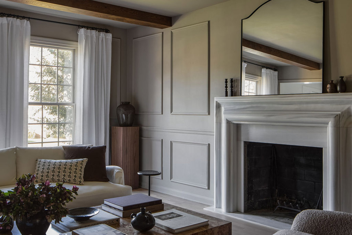
In a McLean Cape Cod–style home, Harrison recently used a neutral taupe color to drench the walls and ceiling of the living space. From there, she used a natural wood table, a jute rug, and a linen couch to bring in several types of natural materials that would complement the color and create visual interest. Even the mantle, imported from Italy, is a pale cream that plays into the same warm neutrals.
‘Go with Your Gut’
Of course, you’ll want to find a color you love before you coat a room in it. Sutter says to “go with your gut” to find the right shade. Look for colors that “bring you joy and happiness,” she says, and colors that are already incorporated into your home’s design.
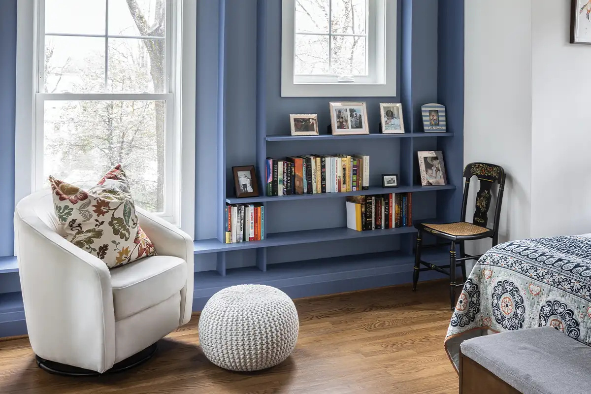
While designing a library in a new-build home, Sutter saw that blue was a key theme throughout the home, so that’s the color she went with for the couch, walls, and built-in shelves. In this space, the fabric for the sofa was the first thing picked out. “We like to choose one element that’s harder to find, so a fabric or a rug, first. And then paint — we can customize it to any color. So that tends to come later in the selection process,” Sutter says.
In the color selection process, Morris even recommends turning to your own wardrobe for inspiration. “What you wear typically indicates colors that you are really, truly drawn to,” she says.
But ultimately, remember that it’s just paint, and you can have some fun with it. “With paint, what’s the worst thing that happens? You paint over it, you paint it white again,” says Harrison. “I think paint is one of the things that you really, actually can take some risks with.”
Feature image by Greg Powers
This story originally ran in our May Issue. For more stories like this, subscribe to Northern Virginia Magazine.